Thursday, 25 March 2010

Filming experience - Rachel Clements

We filmed our footage in one day and this proved to add a significant amount of pressure but we managed to film all the necessary shots to a acceptable standard


problems faced when filming:

  • some shots were more difficult when positioning the tripod because of the size of the locatioin. It needed to be bigger for the shot of the car parking as when poistioning the tripod by the wall so that the car could drive up to the camera, it was quite a squeeze up against the wall and this made it difficult to make sure the tripod was level

  • The lighting was not strong enough, even with the red-head lamp, to create a strong shadow of the antagonist. It appeard quite faint and this could have been because it was not dark enough in the car park or because we needed more light coming from one direction.

  • Our actors were only available for the one day of filming, meaning it was difficult to re-shoot some parts that could have been done better, or parts that we might have missed out.

Success from filming:


  • The shots from inside the car were filmed quite steadily

  • We managed to film almost everything we needed and most were as planned.


Tuesday, 9 March 2010

Titles and Credits Amy Leadbitter

Titles and Credits in a film can have a massive effect on the rest of the film's mood. If the film is a thriller/horror and the credits are contrapuntal, it confuses the audience and misleads them. I will be looking at 6 examples of well composed credits and titles.


Schindler's list


The titles in Schindler's List is one of the two parts of this film that is in colour. The title of the film is placed between two candles, giving it importance and it is cleverly underlined by the outline of a surface in the background, which gives it emphasis. The font of the title is also significant in this sequence. The font used looks similar to handwriting which gives the audience an insight to the film.


The Orphanage


The Orphanage (El Orfanato) is a Spanish film from director Juan Antonio Bayona. The title and credits are contrapuntal to the opening sequence of young children playing in a garden in the summer. The audience has the initial idea that this film has an innocent vibe to it, until we see the title sequence. The names of director, producers and film company are written on wallpaper and they are revealed one by one by children's hands ripping the wallpaper. The title of the film is written with crooked letters; making it look unorganised - perhaps written by a child.
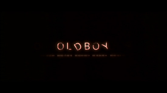


Old Boy

The credits of the film Old Boy are based around time and clocks. The focus seems to be on time going backwards. When the names of director, producers ect. come up on the screen, they are first times, which are going backwards. Even in the name of the film, the D and the Y are ticking, and moving counter-clockwise as the seconds progress. From the titles the audience will assume that the film is about 'turning back the clock' or making up for lost time, which is not in the main plot of the film. These credit confuse the audience, and also gives an insight to what the film may be about.

Hostage

The credits for Hostage are a mix of live action and computer animation. The director, producers and actors names are all written on the sides of buildings in bold black writing, and are revealed as the camer moves. The name of the film is revealed on top of a birds eye view city backdrop accompanied by quiet music and the sound of police sirens. The sirens seem to be paralell to the way the credits are presented, but the quiet music seems contrapuntal. The colours of the titles and even the name of the film suggest a struggle and a high action situation, so when the audience hears quiet music along with the credits, it could be confusing, but at the same time, it seems to fit as this could suggest tension/suspense building, leading to an exciting climax.

The colours of these titles are very dark; red, black and white, and the names of the people working on the film are either black or white. The areas also seem very rough, which also leads the audience to believe this is where the film will be set. Also, in one part of this sequence, one house is singled out from the others and is red. This could suggest a murder site or the site of the films main event.

http://www.artofthetitle.com/2008/02/28/hostage/

Vertigo

Vertigo was made in the 1950's and considering that these titles are very well put together. The main focus of these titles are swirling shapes and patterns. This links to the disease vertigo. I think that these titles are designed to make the audience feel 'dizzy' or uneasy. The titles themselves are written in white, which draws attention away from the patterns. The patterns start from the centre of a woman's eye (extreme close up), and starts swirling from the pupils. Before the titles go into the patterns, there is a close up of a woman's face. The camera moves from her mouth up to her eyes and the screen turns red. This links to victims and blood. These titles are very well made, and they link in very well to the plot of the film.


Kiss Kiss Bang Bang

The titles of Kiss Kiss Bang Bang are very similar in style to those of the film Hostage. The main difference in these titles is that there is movement, and not just pans and reveals. The music in the titles is smooth and relaxed jazz, but it also leads to suspense and tension building, as in the Hostage titles. I believe that many producers choose to use this type of mini narrative because it can give a good insight to the film without giving too much away.

http://www.youtube.com/watch?v=Zzgq2DScdYU


Titles and Credits - Beth Reszke

In class we discussed the different ways in which we could present our credits.
  1. Titles and credits are put on a blank screen at the beginning of the film, or broken up by bits of film. This adds no effect to the narrative of the film, and the only way to suggest mood, themes or atmosphere would be through font and music

    eg. Title > film > credits > film > credits > film
    or
    Title > credits > credits > credits > film


  2. Superimpose credits over film footage. It must be carefully considered where the writing will go in the frame so as not to obstruct characters or action.

Much like the way this title of Schindler's list is presented, this technique can include clever compositional effects in the way the writing is placed to follow lines/shapes.

3. One other way would be to include the credits as part of a 'mini narrative' which can add to the film narrative and create enigmas and set the atmosphere and tone of the film. It would be less likely that we would consider this one for our film.

The Orphanage

One example of this would be the opening to The Ophanage, which includes children's hands ripping off wallpaper, to reveal the title and names.
  • Sound is used carefully in this title sequence as they have used sinister music and the emphasised diegetic sound of the wallpaper being torn to give both an eerie, and aggressive feel to it.
  • Mise en scene - the old, Victorian style look of the wallpaper suggests it is set in an old house, or orphanage and the decor was much different to the 'child friendly' colours and looks of a modern care home. The sleeves of the arms ripping the wallpaper all show the uniform of the orphans that was seen in the preceding scene-making a connection between them.
Five Days

Five Days is a tv drama that has done their opening credits in way that is superimposed over the image. The way they have done this is simple yet very effective for achieving an atmosphere as well as adding to the tone of the film.
  • The sequence shows the names over short slow clips that are not directly part of the film, but may have linked themes, locations, ideas or characters.
It creates a mini narrative as the footage is not part of the film, but it still adds to the film narrative.

The scattered names within the frame are placed so that they are easy to read, against a background that doesnt intrude on the action, and also follow compositional techniques such as lines in the images.
The images used create enigma codes as they make the audience wonder what will happen in the episode. In this case, questions are raised as to 'what has happened to the owner of this shoe?' and 'how will the story progress?'

The have used music to build up a sense of pace and tension of the episode. As well as sounding mysterious and tense, it also mimics the pace of heartbeats, people running, and a train that can be seen in one of the clips with their careful use of pace and steady fast beat. To emphasize this atmosphere, the title sequence includes foleys of eerie indoor, outdoor, and wind noises.

Edward Scissorhands


The credits sequence to Edward Scissorhands are separate to the narrative of the film, but are an example of a kind of mini narrative.
  • Colour has been used consistently in the clip. Dark blue and black is the common theme for the whole sequence to give the idea of it being nighttime. This is then followed up by the first image of the film being a extreme long shot of a castle at night.
  • The blue and black dark background is contrast with the white font which makes it very clear and easy to read.
  • The way the text turns slightly before changing follows the tempo and pace of the eerie music. This creates a mysterious impression and sets the theme for the rest of the film. This feel is achieved by the fact that it moves so slowly, and the images of faces, cobwebbed statues, staircases and machinery are not normal. They are put together and a link is created between them to suggest what the film is about.
  • Camera movement in various shots is very important in achieving their desired effect on the audience. For example, a slow escalating up stairs builds a sense of tension because the audience has no idea what is at the top and whether it will be a surprise or shock.
Bullitt
Bullitt is a 1968 Peter Yates thriller http://www.imdb.com/title/tt0062765/
Its opening credit sequence has the text superimposed over the film opening, but has been done in a way that is very rarely seen with the use of transition movements in different directions.
  • As most other credits done in this way would place the text in the most blank areas of the frame so that the writing is clear and does not distract from the film action. However, in this film, the writing becomes very intrusive into the action happening on screen, and at some points seems to deliberately cover the characters faces.
For the case of this film, they may have done it this way to link with the themes of crime, and hiding identity, facial expression and emotion of the characters in this very early stage so that the audience is lead to be encouraged to watch to see what happens with these characters and what they are like.
  • The transitions take the credits on and off the screen from different directions. Most film credits don't move in this way, and would prefer to have less attention drawn to their credits like this. More recent films do it in this way, and so they way they have used transitions in Bullitt seems a bit outdated.
  • Another consistent aspect of the credits is that some words grow larger and appear to move closer to the camera, and the next shot is seen inside one of the letters. This kind of transition makes the opening to the film more interesting, and links the different film shots and credits effectively.


Old Boy


  • The opening title sequence for Old Boy starts to create a link with clocks and time.
    This effect started to be created when first introduced to the man, whose name means "getting through day by day". Once the credits start, we start to understand a bit more about this in terms of the tone, themes and mood of the film.
  • Some of the characters in the words rotate like clock hands, but they seem to be going backwards. As when before the names come up, numbers resembling time or dates begin to scroll, but they also go backwards. When watching this, I immediately created a connection with this and the film and thought it could signify the fact that time is going by fast, running out, or even going backwards. This was one of the intended effects on the audience and it draws attention and adds intrigue.
  • On screen we see a mixed montage of different types of clocks. From cuckoo clocks, to digital, to traditional pendulum style ones. This emphasised the theme of time, and as all these clocks go backwards, it starts to suggest that we may find out about the past (or future) of the mysterious behaviour or the character previously seen.
  • Sound is used well in this sequence, as the jumbled sounds of all the different types of clocks, (eg. ticking, dongs, cuckoo) starts to distort and sound abnormal - suggesting something is not right.

Number 23
Number 23 is the 2007 thriller starring Jim Carey. It focuses on one man's obsession with the number 23, as he keeps finding that things happen based around this number.
  • The title sequence adds to the narrative of the film, and the audience will later find out that images in the credits symbolise the blood on the crucial book that one character finds.
  • The graphic images of blood splattered pages give the audience insight to the gruesome themes and content which is included in the film and adds intrigue, as the audience wants to know what events could lead up to this gore, violence, murder, crime etc.

Sunday, 7 March 2010

Preliminary video

Click here for our finished preliminary task video
Making the preliminary video was useful to our group as we could quickly grasp the concept of making a thriller and can look back on it whilst making our film opening to see what went well, and what didn't.

Thursday, 4 March 2010

Titles and Credits - Rachel


  1. Credits Separate to the moving image and appear on a blank screen; These can be continuous or cut between the actual film's opening sequence.
  • Credits are separate and can add nothing to fhe film narrative and are simply informative. However, sometime they can be used to communicate something about the film. Music would also convey meaning.


  • Credits are separate to the opening sequence, adding something to the narrative of the film through font style, colour, effects. Usually it is genre expectation.

However

  • Credits can be separate to the opening sequence but create a mini narrative, adding something extra to the film in some way.

2. Credits can be superimposed into the opening sequence.

The Orphanage

The opening sequence is in two parts; the first part establishes a foundation of the plot, in which we see the children playing in their orphanage uniforms and all seems well other then a sinister looking scarecrow which is probably irrelevant to the plot, but is a little disturbing and communicates a darker undertone to the plot. The titles sequence is a separate piece to the film and it seems that the film will be about children and that something mysterious is hidden. we know this from the children's hands (which we recognise as being from the orphanage buy their uniform) ripping off the wallpaper and from the ECU shots of the cracks, swooping through them and this makes it seem that this is significant by the way that we the camerawork focuses on this. The way that the paper they rip off is red and then beneath it is grey could suggest that there is something bad, decaying or evil in the wall and the ripping off paper gives a sense of something being revealed as a main part of the plot.

Se7en
Similarly to "The Orphanage", the film begins with a short introductory sequence, introducing the two main characters and basis for a plot and then cuts to black and the opening credits begin before the rest of the film. The opening credits consist of CU shots of someone making a booklet and of someone of the material in this booklet as well as 'routines' or 'procedures' this character practices, such as removing their finger prints, writing some sort of journal, developing photographs, sourcing and saving pieces of information or tiny fragments of material, colouring out words in books as well as clips of a gun. All these acts are unususal and the images that we see this person collecting are disturbing and the way that these shots are combined with footage of him removing his finger prints etc shows that this may be someone who enjoys these disturbing images. These clips build a character - some sort of loner, violent and agressive (communicated through the CU of the gun or weapon being moved - this shows that he is active in using it) and because there is constant movement in all these clips such as shadows of just his hands its shows that this is an ongoing progress. We do not see this person's identity but know that this is the significant antagonist from the story.

Vertigo

ECU shots of woman's mouth and eyes are very intensely intimate and this makes her seem in a way more vulnerable and exposed to us. When the red filter is introduced this communictaes a sense of danger and her eyes seem panicked.